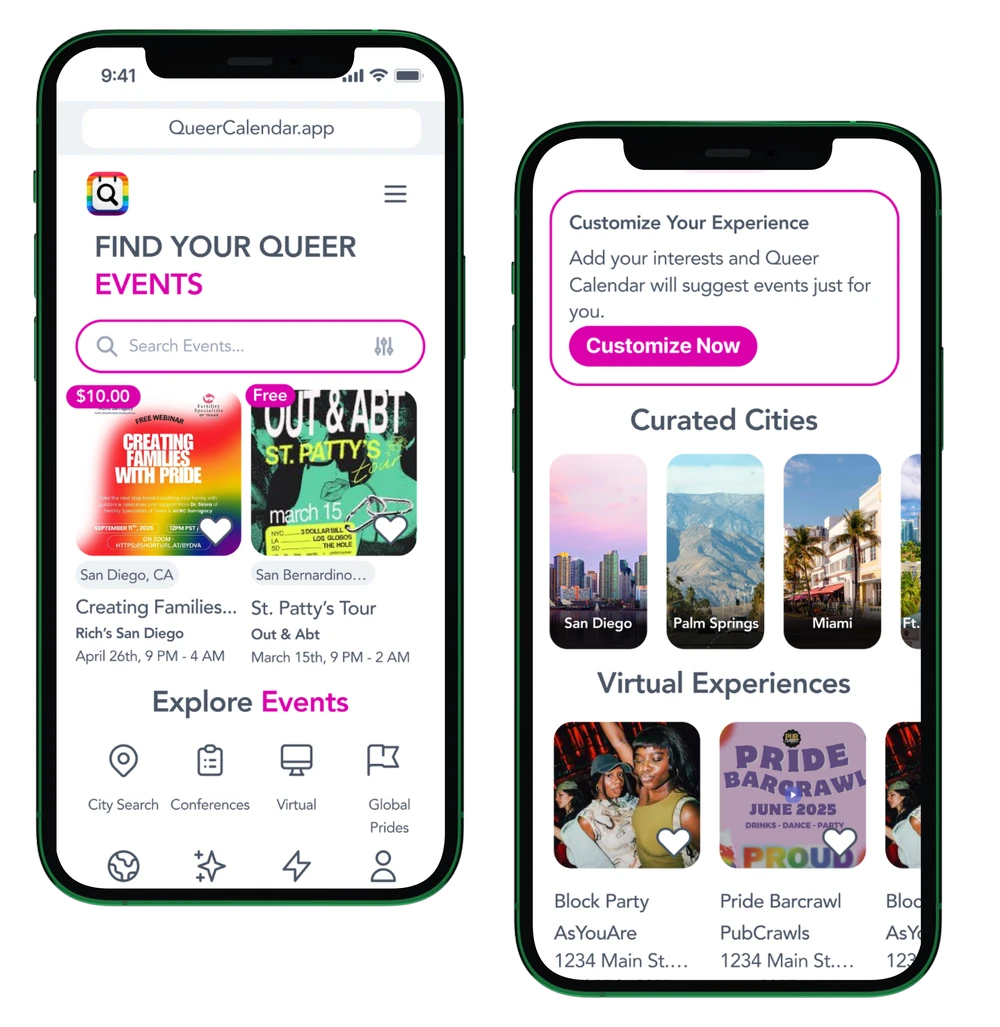
UX / UI Design Case Study
Designing an identity-aware event discovery platform for LGBTQ+ individuals who deserve more than a generic search result.
The Problem
Mainstream event platforms prioritize scale over inclusivity. For LGBTQ+ individuals, this meant manually sifting through events with no way to filter by identity, no safety signals, and a near-total absence of anything beyond nightlife.
Users wanted an easy way to discover inclusive events they could trust. Organizers needed a platform that authentically reached LGBTQ+ audiences without requiring extensive marketing resources. Neither were being served.
Research & Insights
Users want identity-based filtering without feeling boxed in. Flexibility and self-expression matter as much as the filter itself — rigid categories create their own kind of exclusion.
Safety and inclusivity signals matter more than event popularity. An affirming-space badge outweighs a high attendance count for users deciding whether a space is actually for them.
Community-centered language builds trust faster than generic event listings. How the platform speaks is as important as what it says — and generic platforms have never got this right.
Most users discovered queer events through word of mouth because centralized platforms simply didn't exist. This wasn't a marginal gap — it was the entire product opportunity.
Design Decisions
Looking at the live product, several intentional decisions are visible in the final experience.
Each event card leads with its own artwork and color, creating a vibrant, community-made feel rather than a sterile platform aesthetic. The grid celebrates the diversity of events rather than flattening them into templates.
Every card shows city, price range, and timing without requiring a click. Free events are clearly badged in green. This reduces the friction of discovering an event only to find it's inaccessible or too far away.
The persistent search bar and Explore dropdown keep discovery accessible at all times without cluttering the event grid itself. Navigation stays out of the way of the content.
Heart icons on every card let users save events without leaving the discovery flow. A small but meaningful detail that reduces drop-off for users who are browsing rather than ready to commit.
The Process
The hardest challenge wasn't visual design. It was mapping an information architecture that served two fundamentally different user groups without letting either experience bleed into the other.
Multiple iterations balancing discovery and creation flows for users and admins.
Revisiting filters, admin transitions, and where performer pages live.
Low-fidelity layouts to validate hierarchy and separation of concerns.
UI began only after both user and admin flows felt fully resolved.
Adding performer pages introduced an entirely new layer. The platform had to support individual performer discovery, performer-to-event relationships, and admin-level creation flows — all within a single cohesive experience. This required multiple rounds of IA restructuring before any visual work began.
Key Learnings & Impact
Designing for two distinct user groups reinforced something I'll carry into every project. Solving structure before aesthetics leads to more confident, scalable design decisions. The visual layer becomes easier when the underlying logic is sound.
What's Next
With a strong foundation at qcal.app, the next phase would focus on community depth and conversion optimization.
Every great project begins with a conversation.